The Work

The following showcases several projects. Some of these involved a lot of research, some involved user testing, and prototypes. All of them involved critical, analytical, and creative thinking.

I am featuring three UX projects:

And, two video projects:

*NOTE — With over 30 years of Graphic Design, one can accumulate a lot of examples. Design is all about the telling of a story — whether you are talking to one individual through an ad, or many individuals through a book — it’s all about the story you are telling and the action you are trying to promote or activate. These design skills can be readily seen in print or screen, but should remain virtually invisible as they are seamlessly integrated and done with excellence so that the only thing the viewer walks away with is a great story.

That is the power of great design — the ability to become invisible. When something hard is made to look “easy” and all the viewer walks away with is the intended message or experience.

In the two videos showcased, you will see graphic design, writing, art direction, and production skills. They required a lot of prep work in the form of research, sketched storyboards (or thumbnails), and a lot of screen time to just get the work done.

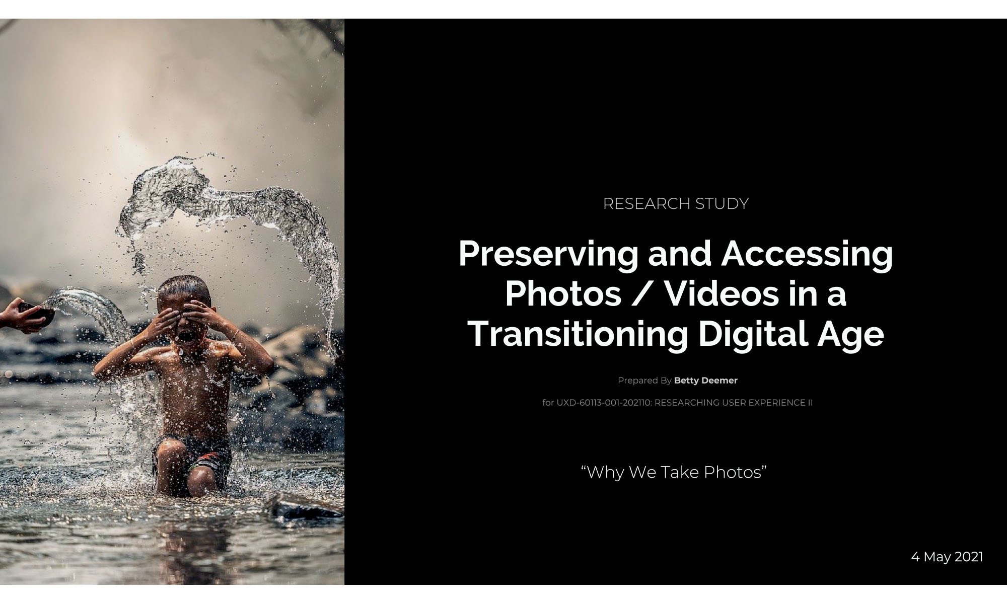
Project #1 — Photo Study

Why do we take photos?

The following research was conducted over a seven week time period starting with selecting the research topic and creating a project plan.

The topic I chose to research and explore was “How do people currently share, curate, and access images and videos of important moments so that others can find and enjoy them in the coming months, years, etc.?”

To find the answer to this question, it quickly became apparent in my research, that an underlying question needed to be asked first — “Why do people take photos?” Answering this basic question would reveal the answer to the overarching research topic, which then exposed opportunities to help people with their new found problems of taking photos in a digital age.

Problem

How does one find a single photo when you’re dealing with thousands dumped into one bucket on your phone? Which photos do you keep? How do you share them? How do you keep them safe?

Continue reading “Project #1 — Photo Study”

Project #2 — Redesign Library Website

Skill Set — Information Architecture:
Content, Labeling & Taxonomy

For this project, a letter has been received from a library asking for help in having their website redesigned “from the ground up” with an emphasis on easy-to-access information and welcoming thematic elements.

I chose to research and redesign the Sharon Public Library (SPL) as my “project” library.

PHASE 1 — Proposal Submission and Acceptance

The first step was to draft and submit a project proposal which included describing the existing information architecture, and to provide a project plan and timeline. In researching the site, one of the first things that became apparent was that any redesign would have to factor in the current service providers which are integral to certain library offerings as the library is a part of a multi-function library network.

Goal

The goal of the site design / reorganization of information is to allow patrons to quickly and easily find the exact information / items for which they are searching.

Constraints

SPL will continue to use their current host provider and modifications to the site will need to be made in conjunction with that site’s developers.

Continue reading “Project #2 — Redesign Library Website”

Project #3 — 10ft Interface

Controller Prototype | Large Screen Design: Designing Interaction for Across the Room Viewing

Designing the interaction between someone who is probably sitting in a darkened room and only interacting with a controller by touch requires some unique characteristics.

There is a balance between putting button options on a remote that will help the viewer who is watching a large screen 10 feet away, and needlessly complicating the remote so much that the user has no other option than turning on a light — just to see how to work the “thing” that’s supposed to be helping — actually works.

At this point, an absolute “Fail” occurs if someone has to actually try and find a manual.

True success in designing a controller is that it can be used without the aid of sight. This not only helps the user who is sitting in a darkened room, it is essential for those who have low or poor vision. Designing for accessibility helps all of us.

Continue reading “Project #3 — 10ft Interface”

Graphic Design | Video Production

Video Production

My career spans over 30 years experience in Art Direction, Graphic Design, and Writing. All of these skills can be seen in the development of the following corporate videos which were produced for large sales conventions.

“Show The Way”2016 Chicago Countdown Movie [5 min]

This video was designed as a “count down,” i.e., to get people’s minds focused on the meeting and to get them into their seats. It was designed to come in with very loud audio that quickly transitions to a different auditory pace. The visual effects were designed to prep attendees for topics to be discussed and bring familiarity to these topics from prior viewing. Stakeholders deemed the video to be very successful.

Purpose: Focus attendees on the meeting; highlight topics covered; create excitement.

Impact: Feedback from the convention was that the video fulfilled its purpose by getting people into their seats on time and focused on the start of the meeting.

Note: The visual effects were created in Adobe After Effects, and the Soundtrack was cut and edited in Adobe Premier along with the other video clips.]

“Turner Hodge”A Success Story [6 min]

This movie developed out of the need to tell a success story for a national convention. The power of the story comes to life through words and pictures and effectively selecting the correct song to play beneath the storyline. Originally, the stakeholders wanted a PowerPoint presentation after which the Hodge Family would come on stage. I advocated for telling the story in video form as it would give more power and emotion to the experience.

After researching the incident, talking with the family and other stakeholders, I wrote and developed a script, edited the photos in Photoshop, and compiled and edited the video and audio in Adobe Premier Pro. After the video played, the Hodge Family came on stage to thunderous applause. The stakeholders and convention attendees stated that the video was a very powerful presentation at the national convention and many copies were requested afterwards.

Purpose: Tell the story of Turner Hodge; highlight the salesperson who sold their policy.

Impact: This video made clear not only the product being sold, but its importance to the families who purchase the product — in this case, the difference between financial stability or instability.

The above videos can be seen at: https://vimeo.com/bettydeemer